Visual Identity: Cohesive Design & Customization for Brand Packaging
A strong visual identity turns packaging into a brand touchpoint. The colors, typography, and materials you select communicate who you are before anyone opens the box. For PR mailers, event collateral, and mobile tour materials, consistent product design builds recognition and signals the premium quality your audience expects. Packaging extends your brand beyond the moment. A well-designed kit or mailer continues to tell your brand's story days after it arrives, creating lasting impressions that strengthen relationships with clients, influencers, and employees.
Media gifting campaigns perform better when the packaging design takes into account how recipients will photograph and share the contents across their social channels.
Forming a Consistent Visual Identity in Brand Packaging
Packaging design starts with decisions about what the brand needs to communicate and how recipients will interact with it. A PR mailer heading to influencers requires a personalized visual treatment compared to corporate gifting for client appreciation. Budget, timeline, and fulfillment methods shape which design choices are realistic and which create production headaches. Typography sets the tone before anyone reads a word. Clean sans-serifs read as modern and direct, while serif fonts suggest tradition or refinement. Color palettes trigger associations—some deliberate, others cultural or industry-specific.
Graphic elements, such as patterns, icons, or illustrations, fill space and reinforce themes, but they require a purpose beyond decoration. Structural decisions about box style, closure type, and insert configuration affect both the unboxing sequence and shipping durability. These components don't work in isolation. When they align, packaging feels intentional instead of assembled from stock options.
Special edition boxes with limited-run finishes or serialized numbering create exclusivity that drives higher engagement rates among VIP recipients and influencers.
Designing Unboxing Sequences That Drive Content Creation
Unboxing generates shareable moments when the reveal sequence builds interest. Exterior packaging creates the first impression, then interior layers control pacing—what recipients see first, second, third. Foam sculpts hold products in place while adding visual structure. Custom inserts separate components and guide the eye through each element. Placement determines whether someone photographs individual items or the full spread.
Magnetic closures, specialty finishes, and 360-degree branding indicate strong marketing efforts and investment before the box is even opened. For PR mailers and seeding kits, these production details influence whether influencers post content or file products away. The difference often comes down to whether packaging looks mass-produced or specifically built for the campaign.
A PR box with complex assembly requirements will extend fulfillment timelines, so factor in extra production time for campaigns with tight deadlines.
Logo Integration and Brand Mark Applications
Logos appear on multiple surfaces, including exterior boxes, interior inserts, custom packaging components, and promotional items. Exterior placement handles shipping visibility and brand recognition at the point of delivery. Interior applications continue to maintain the brand's presence as recipients unpack their contents. Size and position depend on the package format and what else competes for attention. A logo designed for flat printing may need adjustment for three-dimensional structures or curved surfaces:
- Embossing: Creates raised texture that adds dimension and catches light at angles.
- Foil Stamping: Applies metallic finishes in gold, silver, copper, or holographic patterns for reflective shine.
- Laser Etching: Burns permanent marks into wood, metal, and rigid materials without ink.
Testing applications during prototyping catches readability issues before they occur in complete production runs.
Creating Consistent Packaging for Multiple Campaigns
Brands running multiple campaigns or sending different kit tiers need visual consistency across variations. A loyalty program might include bronze, silver, and gold packages with different contents but shared design language. PR campaigns often require press kits, influencer packages, and retail versions that look related without being identical. Color rules, typography standards, and logo placement guidelines confirm that each kit variation remains consistent.
Templates speed up production for repeat programs or multi-phase rollouts. Set layouts, spacing standards, and insert configurations enable new campaigns to move into fulfillment faster—particularly for tiered gifting, where recipient levels receive different items in similar packaging structures, or for brands shipping monthly kits with rotating contents.
Organizing Components for Clear Unboxing Flow
Welcome cards, instruction sheets, and product details compete for attention when a box opens. Placement determines what recipients see first. Top-layer items get immediate focus, while nested components create secondary reveals. Size, color contrast, and positioning control where the eye goes—larger items dominate, bright colors pull focus, and centered placement signals importance.
Kits with multiple items need organization that makes sense during assembly and unboxing. Consistent spacing between components, protective separation for fragile items, and logical groupings by category or use keep the experience straightforward and uncluttered. Insert design directly affects packing speed—complex configurations slow fulfillment, while straightforward arrangements move through assembly faster.
Material Selection and Texture Considerations for Brand Consistency
Matte finishes photograph differently than glossy coatings. Soft-touch laminate feels different in the hand than standard paper stock. Textured substrates, such as linen or kraft paper, convey a handmade or natural aesthetic, while smooth surfaces convey a polished and modern look. These material choices set the tone before recipients read any copy.
Rigid boxes protect contents during shipping more effectively than folding cartons, but they take up more warehouse space and cost more per unit. Corrugated materials withstand rough shipping conditions and accommodate custom printing, although print quality may differ from that of coated stocks. Specialty substrates—such as metallics, translucents, and wood veneers—add visual interest but often require longer lead times and higher minimum quantities. Material decisions ultimately come down to budget, storage capacity, shipping distance, and the level of protection necessary for the contents.
Adapting Packaging Design Across Different Formats
A logo and color palette designed for a 12x12 rigid box require adjustments for compact mailers, cylindrical tubes, or custom shapes. Elements sized for large presentation boxes become illegible on small loyalty gifts. Designs scale up or down, depending on what fits the format, and remain readable at that size.
Assembly complexity determines whether a design works for 100 units or 10,000. Hand-placed inserts, individually wrapped components, or custom foam configurations slow packing. Simple structures with minimal pieces move through fulfillment faster. Die-cut patterns that nest efficiently reduce material waste and storage space. Design decisions made early—such as the number of components, closure types, and insert layers—directly impact how long the assembly takes and whether the project fits within the timeline.
Customization Techniques for Personalized Brand Packaging
Variable data printing adds individual names, custom messages, or personalized details to each package without slowing production. Recipients see their name on welcome cards, exterior labels, or interior inserts. Fulfillment systems sort contents by recipient preference—different product sizes, color selections, or item combinations within the same campaign structure.
Specialty decorating services create one-of-a-kind packaging elements. Laser etching burns designs into wood boxes or metal tins. 3D printing produces custom shapes that are impossible with traditional manufacturing methods. Embossing and debossing add raised or recessed textures. These techniques are more expensive and require longer production times than standard printing, but they create packaging that stands out from the market.
Printing Methods and Specialty Finishes
Digital printing accommodates variable data—different names or messages on each piece. Offset printing delivers more precise color matching but requires plate production, so every design change means new plates and added costs. Each finishing technique affects cost, production timeline, and how the final package photographs:
- Spot UV Coating: Creates a gloss effect on specific areas while leaving the rest matte, allowing logos to pop and text to remain readable.
- Foil Stamping: Applies metallic finishes in gold, silver, copper, or holographic patterns.
- Metallic Inks: Print directly onto surfaces, but appear less reflective than foil.
- Embossing: Raises designs above the surface, adding texture that shows up in photos.
- Debossing: Presses designs below the surface to create recessed details.
- Laser Etching: Burns permanent marks into wood, leather, metal, and some plastics through controlled burns that create contrast.
Lead times vary depending on the method and order complexity.
Sustainable Design Practices and Eco-Friendly Customization Options
Reducing package size simultaneously cuts shipping costs and material waste. Sustainable options typically cost more than standard materials, but some clients prioritize environmental choices to match corporate commitments:
- Recyclable Materials: Single-material packaging, whether all paper or all plastic, simplifies recycling compared to mixed-material designs.
- FSC-Certified Papers: Sourced from responsibly managed forests with third-party verification.
- Soy-Based Inks: Plant-based alternative to petroleum inks that maintains print quality.
- Biodegradable Protective Fills: Break down naturally as alternatives to plastic bubble wrap or foam.
Some clients weigh cost against other campaign priorities. Reusable packaging turns single-use mailers into functional items that recipients keep. Rigid boxes with magnetic closures become storage containers. Branded backpacks and tote bags continue to be used daily, long after the initial campaign. This approach works well for corporate gifting and loyalty programs where extended brand presence matters more than single-moment impact.
Stunt Deliveries and Experiential Packaging Moments
Stunt deliveries turn the arrival of packaging into an event. Instead of a standard box on the doorstep, recipients experience something unexpected—a delivery person in costume, an oversized prop, or an unconventional vehicle. These deliveries generate immediate social media content because the moment itself surprises people enough to film or photograph. Execution depends on coordination between packaging design, delivery logistics, and on-site staff. The packaging needs to withstand non-standard transport—a large-scale prop carried by multiple people, something delivered via bicycle or specialty vehicle, or items requiring setup on arrival.
Timing matters: deliveries scheduled when recipients are present and able to engage create better content than packages left at empty doorsteps. Stunt deliveries cost significantly more than standard shipping due to custom logistics, specialized staff, and production of experiential elements beyond the package itself. They work best for high-profile influencer campaigns or VIP client gifting where the delivery spectacle matches the premium contents inside.
Brand Packaging in Practice
These campaigns demonstrate how design decisions, material choices, and production methods are applied in finished packaging.
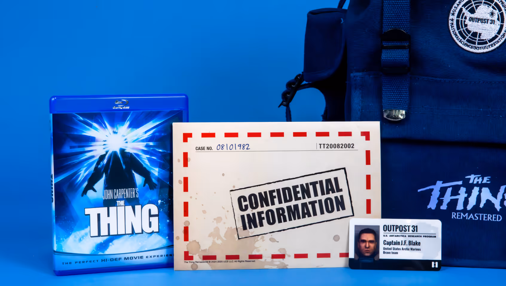
Atari Survival Kit Design for Gaming Campaign
The Thing Remastered kit utilized an embroidered backpack as its primary container, rather than a box. Custom patches and screen-printed emblems were applied to the exterior. The backpack doubled as packaging and a functional item that recipients could reuse after opening. Welcome cards and custom key cards sat at the top of the backpack for immediate visibility when opened. Other items—a water bottle, compass, flashlight, paracord, and copies of the game and film—nested in compartments below.
This arrangement protected items during shipping and controlled the reveal sequence as recipients unpacked layers.
Materials matched the survival theme, featuring durable canvas for the backpack, military-style components for the compass and flashlight, and weatherproof finishes where necessary. The kit included branded patches that recipients could remove and attach to other gear.
CAVA Claw Machine Interactive Packaging Experience
CAVA's claw machine mailer replicated the structure of an arcade game. The box featured transparent windows, allowing recipients to see the contents inside, branded graphics that matched CAVA's colors and style, and a functional claw mechanism on top. Recipients manipulated the claw to grab items from inside the box—turning delivery into a game before accessing the products. The packaging required custom fabrication to build the claw mechanism and confirm it functioned after shipping.
Engineering focused on two problems: making the claw work reliably and protecting the contents if recipients couldn't extract items smoothly. The assembly process involved more steps than standard box packing due to the presence of mechanical components. The arcade theme utilized CAVA's existing brand colors, fonts, and graphic style, but applied them to game-inspired elements, such as coin slots, joystick illustrations, and prize window frames. The design stayed recognizable as CAVA while looking different from their standard packaging.

Ruggable Luxury Lifestyle Packaging Design
Ruggable's Rustic Rivera mailer used printed rigid boxes with magnetic closures and full-coverage exterior branding. Custom interior inserts held the rug samples in place and separated them from promotional materials. The Rustic Rivera theme features earth tones, textured print finishes, and lifestyle photography that showcases the rugs in styled home settings.
The packaging accommodated different rug styles and sizes using the same box structure with variable inserts. Product photography, brand colors, and typography remained consistent across variations, verifying that different mailers appeared cohesive.
Layout templates let new rug styles slot into established positions without redesigning the entire package. Materials included FSC-certified paperboard for the rigid box, recyclable inserts, and minimal plastic components. The box construction prioritized single-material recyclability—recipients could break down and recycle the entire package without needing to separate mixed materials.
Activate Your Visual Identity Through Premium Packaging
Activate designs and produces custom PR boxes, mailers, and corporate gifting from our 75,000 sq. ft. facility in Metro Detroit. We handle material sourcing, specialty decorating, and assembly in-house, with capabilities that include laser etching, 3D printing, embossing, and custom fabrication. Complete our contact form to design packaging that reflects your brand's story and aligns with your campaign objectives.
Frequently Asked Questions
What is visual identity in brand packaging?
Visual identity in brand packaging refers to the consistent use of colors, typography, logos, and graphic elements that make packaging recognizable as part of a specific brand. Visual brand identity components work together across boxes, mailers, inserts, and promotional materials to create a cohesive presentation that target audiences immediately associate with the brand.
How does packaging design maintain visual consistency across different campaign types?
Packaging design maintains visual consistency through established rules for color application, typography usage, logo placement, and layout structure that adapt to different formats without losing recognizability. Templates and design systems enable PR mailers, corporate gifts, and event collateral to appear cohesive, even when their contents and packaging formats differ significantly.
Why does material selection affect brand perception in packaging?
Material selection affects brand perception because physical qualities, such as texture, finish, and substrate, communicate messages about quality and values before recipients interact with the content. Matte finishes, rigid boxes, and specialty materials, such as soft-touch coatings or textured papers, signal a premium positioning. Standard corrugate and glossy finishes convey different messages depending on the context and execution.
When should brands use specialty printing techniques for packaging?
Brands should utilize specialty printing techniques, such as foil stamping, embossing, or laser etching, when the campaign requires differentiation, targets high-value recipients, or aims to generate social media content through interactive unboxing moments. These techniques are more expensive and require longer production timelines than standard printing, making them suitable for influencer kits, VIP gifting, and product launches where a premium presentation is important to achieving campaign objectives.
Where do logo applications appear on premium PR boxes?
Logo applications appear on exterior surfaces for shipping recognition and brand visibility at delivery, on interior inserts and welcome cards to reinforce brand presence during unboxing, and on individual packaging components, such as tissue paper, stickers, or branded items included in the kit. Placement depends on what recipients see first and where logos remain visible throughout the unboxing sequence.
Which customization options work best for large-volume fulfillment?
Customization options that work best for large-volume fulfillment include variable data printing for personalized names or messages, tiered contents using the same packaging structure with different inserts, and modular design elements that accommodate product variations without requiring a complete redesign. Complex hand-assembly, custom foam configurations, or individually wrapped components can slow down packing speed and limit scalability for campaigns requiring a fast turnaround.